Unusual (But Decadent) Fall Color Palettes
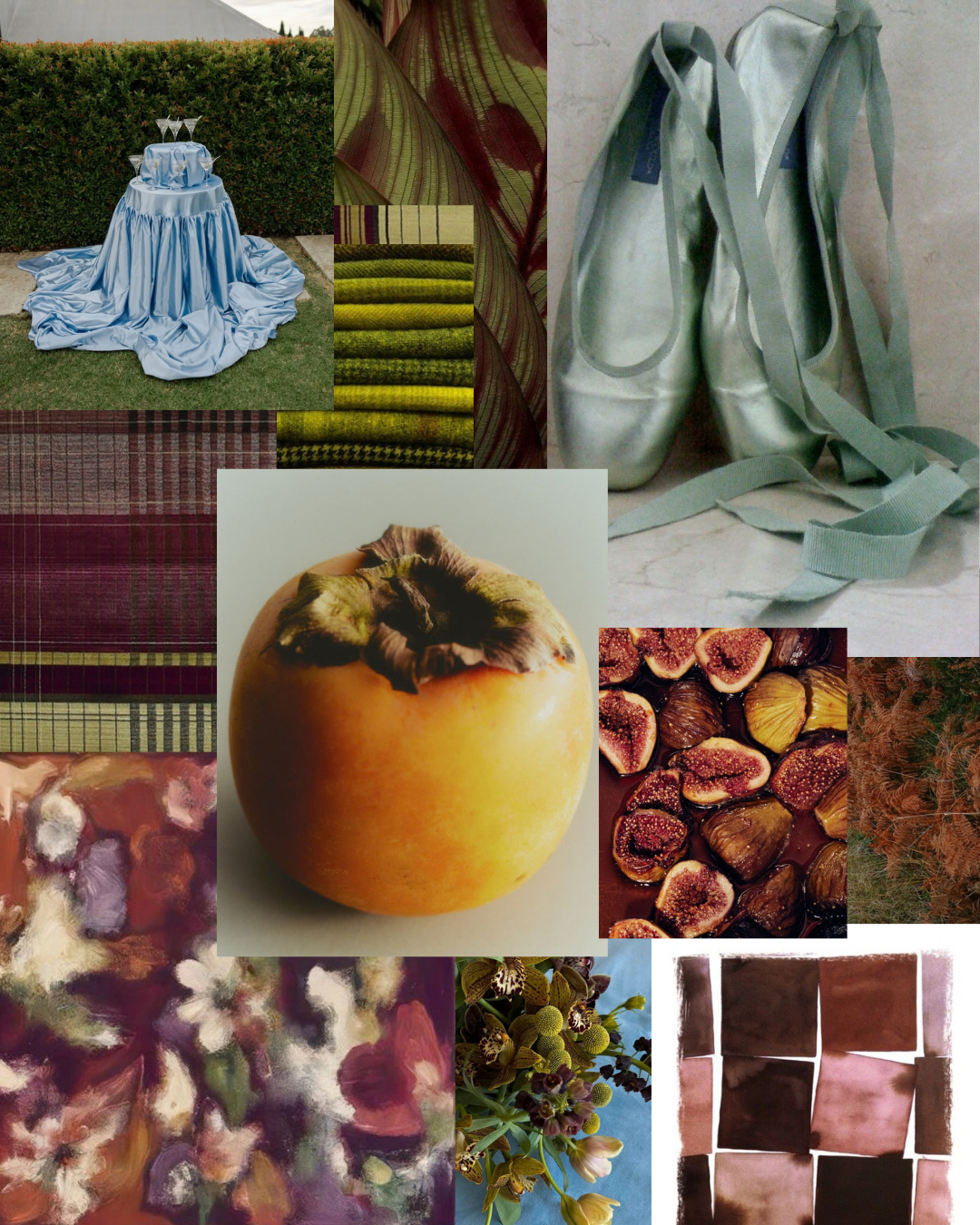
Fall has a reputation.
Burnt orange. Deep burgundy. Olive green. Maybe a little dusty rose for good measure.
And while there is absolutely nothing wrong with a beautiful autumnal palette, we think fall weddings deserve a little more imagination.
Because autumn isn't only about the colors we associate with changing leaves. It's about atmosphere, candlelight, velvet, old stone, overgrown gardens, warm afternoons turning cool, fruit spilling across a table-scape, and that particular kind of romance that feels a little more cinematic this time of year.
So, if you're planning a fall wedding and the traditional rust-and-burgundy palette isn't quite speaking to you, consider this your permission slip to go somewhere a little unexpected.
Here are five unusual, but decidedly scrumptious, color palettes we're dreaming about this fall.
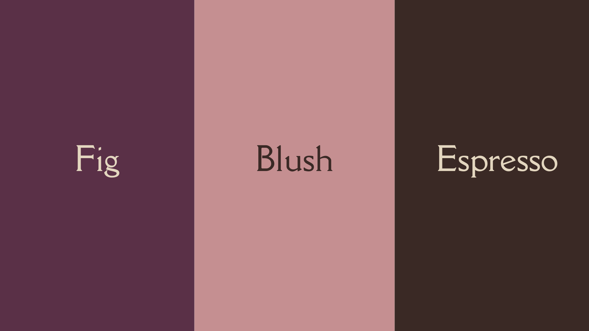
01 - Fig + Blush + Espresso
Romantic · Moody · Intimate
Deep fig and espresso bring the mood, while dusty blush and antique ivory keep the palette from feeling too heavy.
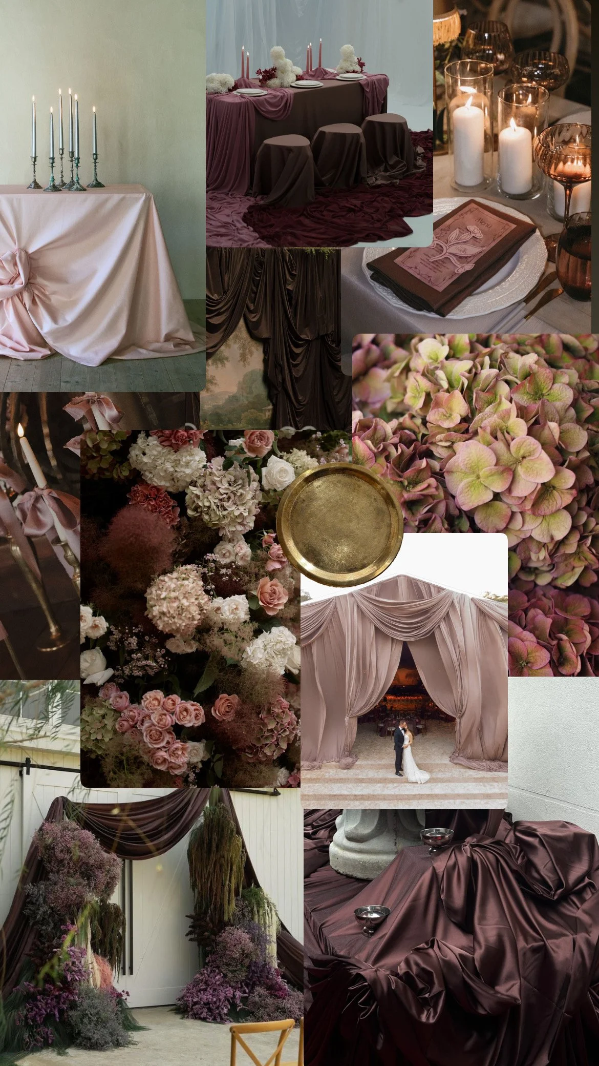
This is fall for the couple who wants romance without leaning rustic. Think loose, garden-inspired florals, soft candlelight, textured linens, and a table that feels as though it has been gathered rather than styled.
The beauty of this palette is in the tension between the dark and the delicate, ripe fig against faded blush, nearly-black brown against warm ivory.
It feels like an intimate dinner party at the end of October.
Pair it with:
Garden roses · dahlias · scabiosa · espresso-toned vessels · antique brass · velvet · figs and pears · candlelight
The Palette
Deep Fig
Dusty Blush
Espresso
Antique Ivory
Muted Plum
The World
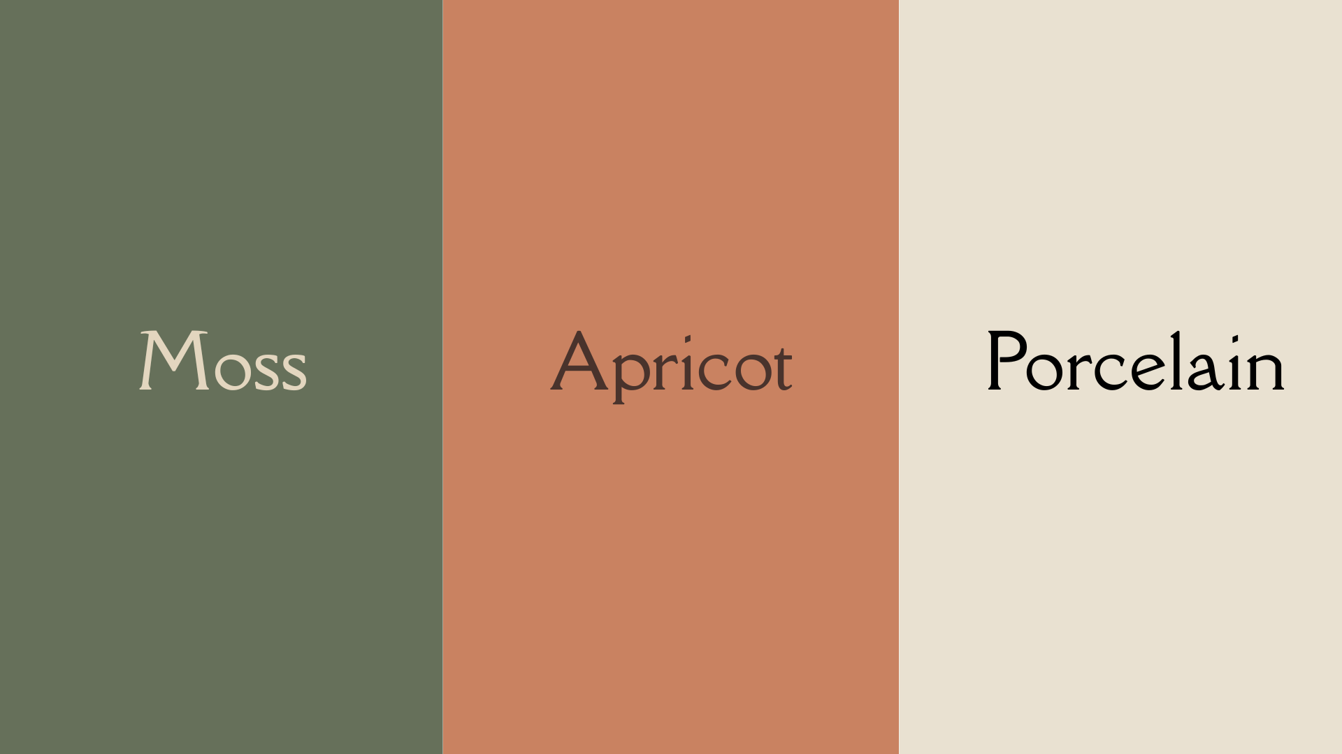
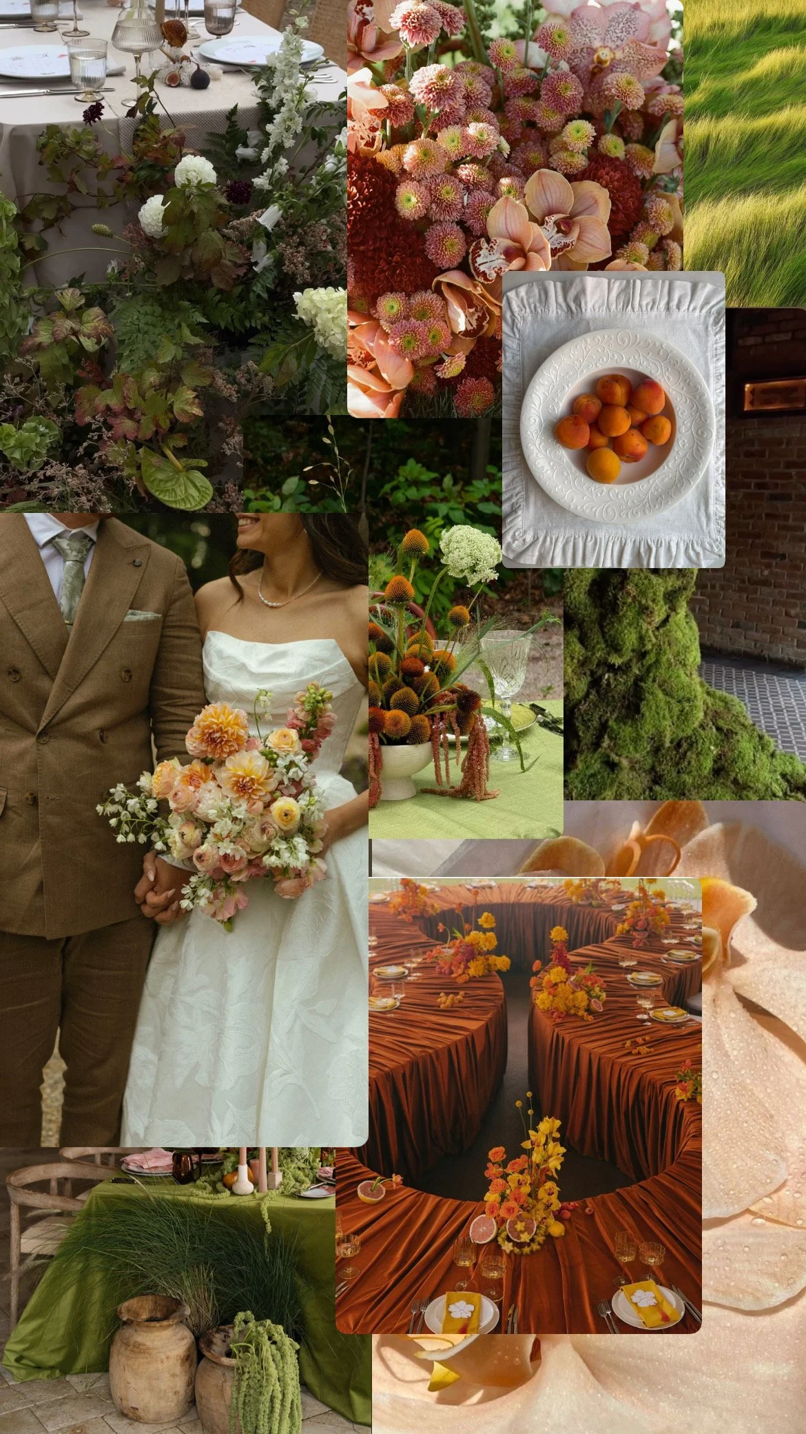
02 - Moss + Apricot + Porcelain
Organic · Antique · Quietly unexpected
This is the palette for the couple who wants their wedding to feel as though it has existed for a very long time.
Soft moss and deep olive ground a faded apricot, while porcelain and wheat-colored neutrals keep everything feeling light and collected.
Rather than leaning into the obvious colors of autumn, this palette borrows from the things surrounding them, moss-covered stone, aging gardens, dried grasses, sun-warmed fruit, and old houses tucked into the landscape.
It feels particularly beautiful when paired with natural textures and imperfect details.
Beautifully collected.
Pair it with:
Moss · olive branches · faded apricot florals · stoneware · weathered wood · linen · pears · aged brass
The Palette
Moss
Burnished Apricot
Porcelain
Faded Wheat
Deep Olive
The World
03 - Dusty Blue + Merlot + Antique Rose
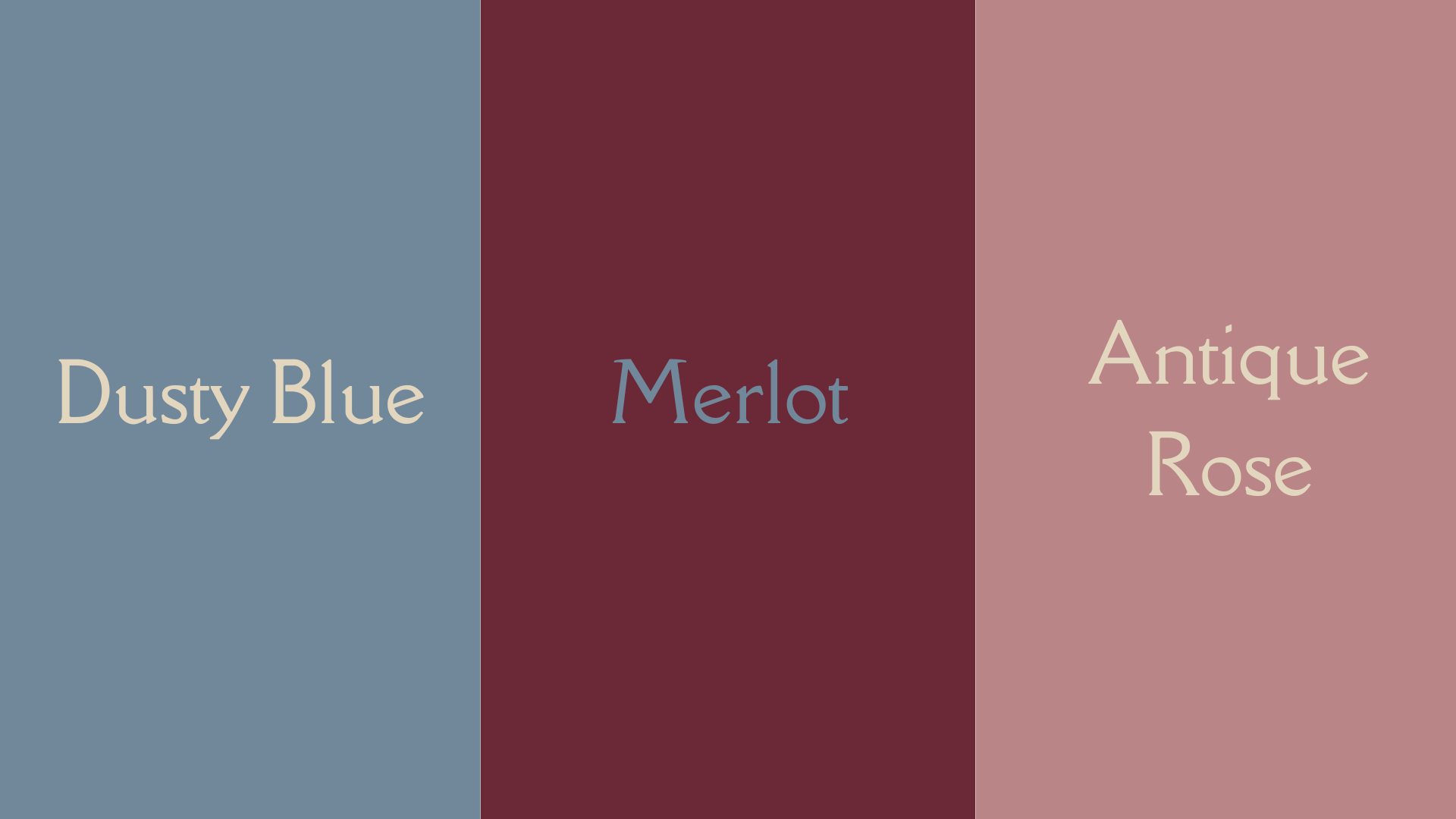
Painterly · Elegant · A little melancholic
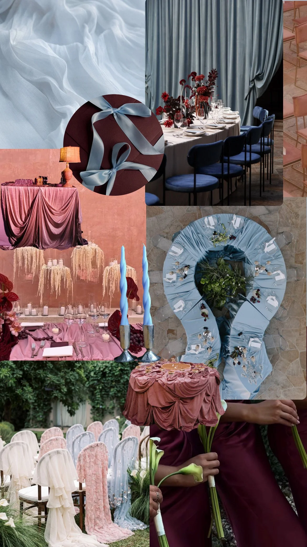
What if autumn looked like an old oil painting?
This palette is our answer.
Dusty blue brings an unexpected coolness to the season, while merlot and antique rose keep it grounded in something unmistakably romantic.
There is something wonderfully nostalgic about this combination. It feels faded rather than bright, as though the colors have been sitting in the pages of an old book or slowly weathering on the walls of a European home.
We'd lean into the softness here: loose florals, brushed textiles, aged finishes, and plenty of candlelight.
The result is romantic without feeling overly sweet.
Pair it with:
Dusty blue linen · wine-toned dahlias · antique roses · old-world stationery · pewter · faded silk · taper candles
The Palette
Dusty Blue
Merlot
Antique Rose
Warm Ivory
Faded Brown
The World
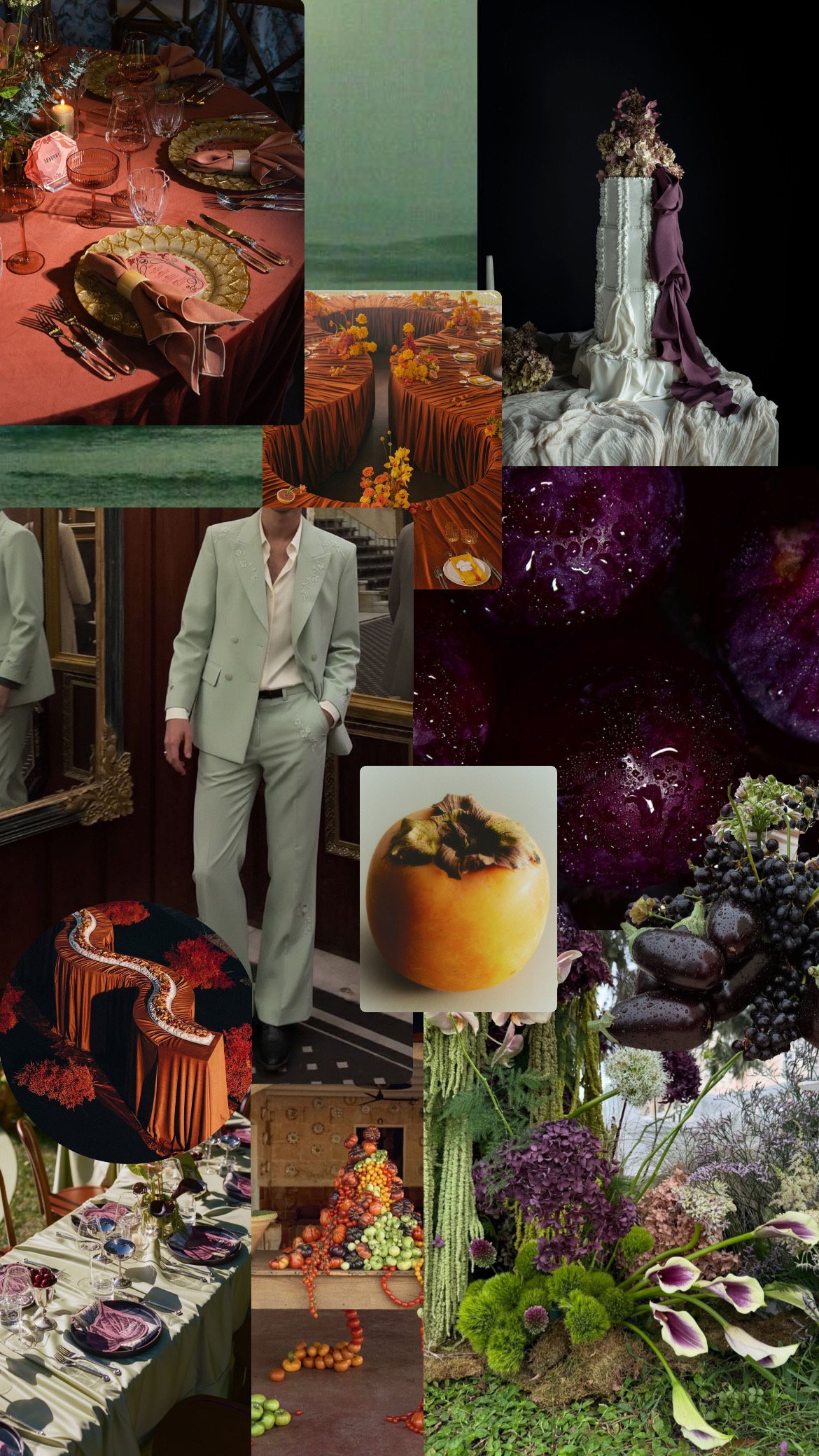
04 - Celadon + Persimmon + Plum
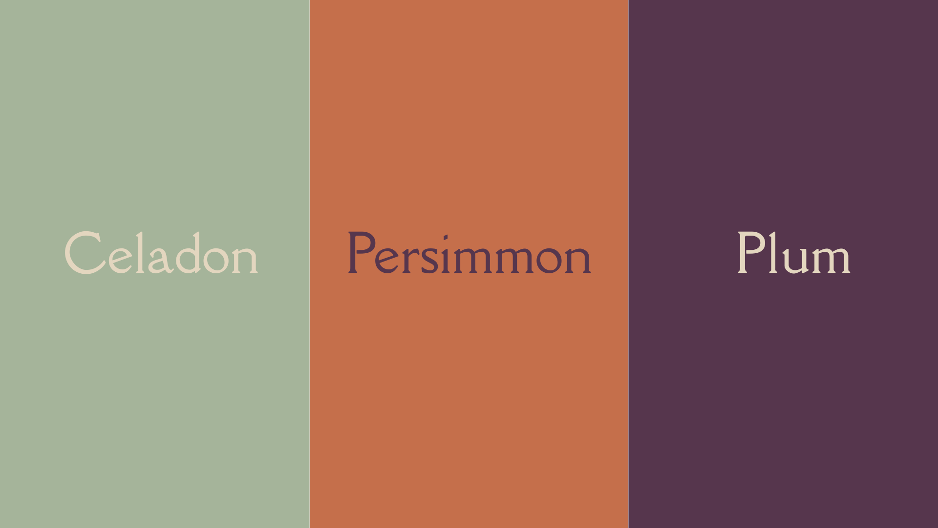
Artistic · Colorful · Collected
For the couple who isn't afraid of color.
Celadon brings a soft, almost unexpected freshness to the palette, while muted persimmon and deep plum make it feel firmly rooted in autumn.
The key here is choosing colors that feel aged rather than saturated. We're not talking pumpkin orange and bright purple. We're talking the softened, slightly weathered versions of those colors, the colors you might find in an old painting, a vintage textile, or a forgotten garden.
This palette would be beautiful in a space with plenty of natural texture: stone, wood, raw linen, ceramic vessels, and flowers arranged with a little movement and imperfection.
It feels artistic without trying too hard.
Pair it with:
Celadon linen · muted persimmon dahlias · plum scabiosa · ceramic vessels · warm ivory · trailing greenery
The Palette
Soft Celadon
Muted Persimmon
Deep Plum
Cream
Warm Brown
The World
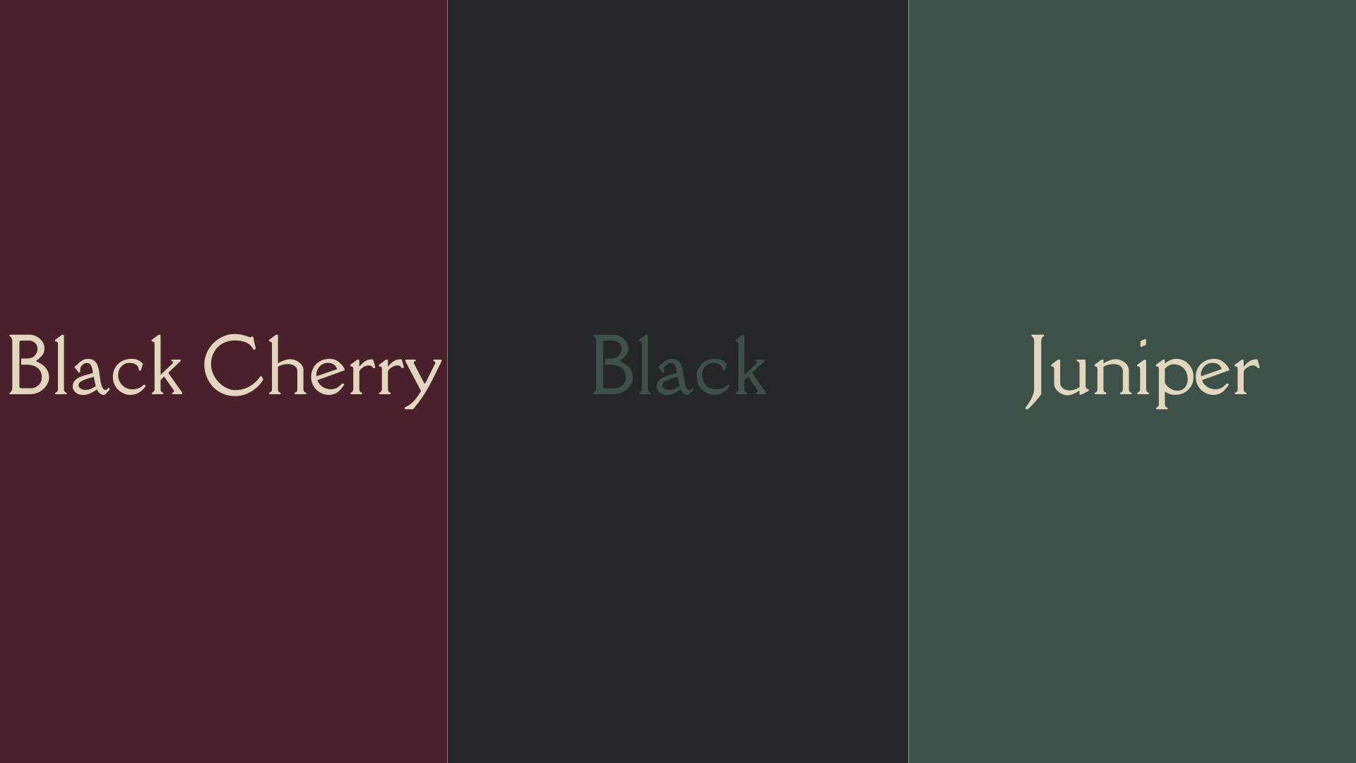
05 — Black Cherry + Soft Black + Juniper
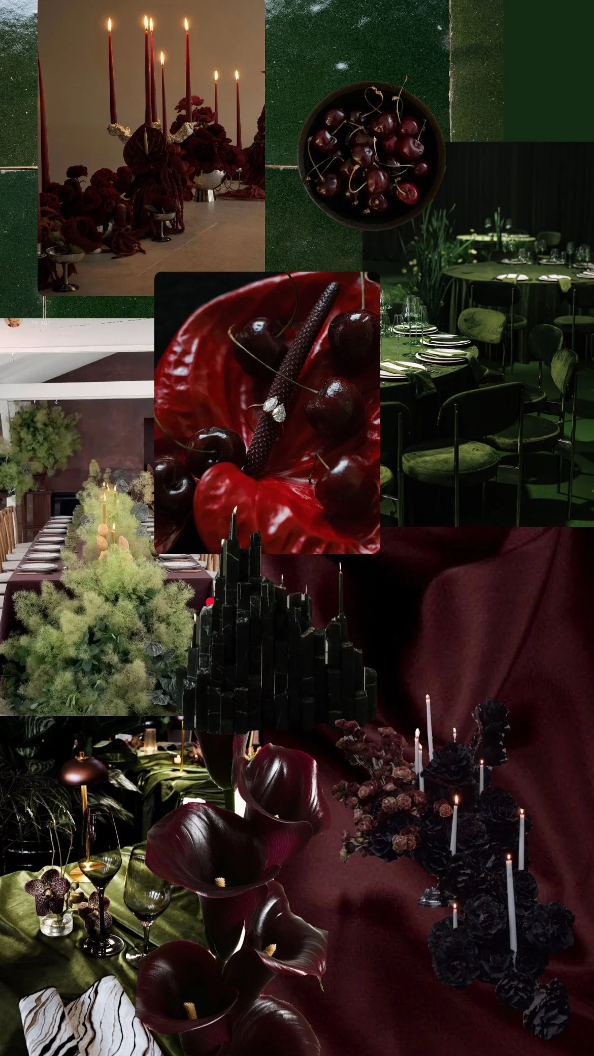
Atmospheric · Dark · Unapologetically autumnal
And then there's this version of fall.
The colder one.
The one that exists before the sun comes up, when the fields are covered in low-lying fog and everything feels slightly muted by the weather.
Think wet pavement. Wool coats. Dark florals. Leather boots. Misty mornings. Overcast skies. A house with warm light glowing through the windows while the world outside is cold and grey.
This is autumn stripped of its warmth.
Fog grey and stormy blue create the foundation, while juniper and black cherry bring depth. Soft black keeps everything grounded.
It's moody without being gothic for the sake of being gothic.
It simply feels like October when October gets a little darker.
Pair it with:
Smoky grey silk · charcoal linen · black cherry dahlias · juniper foliage · weathered silver · black taper candles · dark stone · leather details
The Palette
Fog Grey
Storm Blue
Juniper
Black Cherry
Soft Black
The World
Autumn Doesn't Have to Look Like Autumn
The best wedding palettes aren't necessarily the ones that feel the most seasonal.
They're the ones that feel the most you.
Maybe your version of fall is gobs of candlelight and antique brass hardware. Maybe it's moss-covered stone and a table-scape that feels like a feast.. Maybe it's dusty blue against deep wine. Or maybe it's the quiet, almost gothic beauty of a chilly, foggy October morning.
Fall gives us an incredible starting point, but there is no reason we have to stay inside the traditional color wheel.
At Lilac & Limelight, we're interested in the spaces between seasons, the unexpected combinations, and the little details that make a wedding and event feel less like a template and more like a world of its own.
Because beautiful isn't the goal.
Feeling something is.
Can’t wait to have you back for more
- Lilac & Limelight Design Co
Dreaming up a wedding that feels entirely its own? Lilac & Limelight Design House creates floral design, creative direction, tablescapes, and installations for intimate celebrations with a little more feeling.